

The goal of accessible Information and Communication Technologies (ICT) is to provide equal access to digital information so that we can all be active participants in today’s digital society. It’s about equality and inclusion.
Accessible documents of all types (Word processing, Spreadsheets, Slideshows, PDF, HTML, and more) are better for everyone, whether they have a disability, or use Assistive Technology (AT) or not. Accessible documents are easier to find, search, read and maintain. Regardless of the type of document, accessibility is defined by four essential, key characteristics: Perceivable, Operable, Understandable, and Robust (often referred to as the P.O.U.R. Principles. The P.O.U.R. Principles are based on the Web Content Accessibility Guidelines (WCAG) 2.1 which includes a total of 78 testable success criteria for accessibility. Rather than remembering all 78 tests for accessibility, the P.O.U.R. Principles offer a simple way to determine how accessible your content is.
What are the P.O.U.R. Principles
Let’s take a quick look at these:
Perceivable
- Provide text alternatives for non-text content.
- Provide captions and other alternatives for multimedia.
- Create content that can be presented in different ways, including by assistive technologies, without losing meaning.
- Make it easier for users to see and hear content.
Operable
- Make all functionality available from a keyboard.
- Give users enough time to read and use the content.
- Do not use content that causes seizures or physical reactions.
- Help users navigate and find content.
- Make it easier to use inputs other than the keyboard.
Understandable
- Make text readable and understandable.
- Make content appear and operate in predictable ways.
- Help users avoid and correct mistakes.
Robust
- Maximize compatibility with current and future user tools.
- Use semantic structure and follow established best practices for accessibility for the document format you are working with.
How can I make my documents more accessible?
Making a document accessible is best when you are in the early phases of creating it. Below are some guiding principles that we can all use to make our documents more accessible.
1. Use a clear and descriptive file name
The first piece of information most individuals will encounter when accessing a document is the file name. A unique, descriptive file name helps individuals understand the general topic of a document and makes it easier to find the next time you need it.
For example, “OVR-2_Application_for_Services.docx”
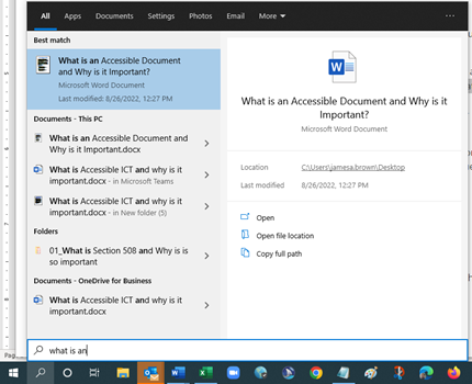
2. Give your document a Title property
Accessible documents should have titles that describe their function or purpose. This is used in a variety of ways and is helpful for all users. For Microsoft Office documents, go to File > Info > Properties > Title (or from the keyboard: Alt, F, I, S, 1) to add a title to the document. Upon opening, this is the first thing read by a screen reader and helps the user to verify that they are on the right document. For some applications, this will also be displayed visually in the title bar at the top of the applications window. This also helps with searching for a document you have stored on your computer. Harness the power of the search bar in Windows (press the Windows key on your keyboard and start typing) as shown below:
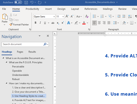
3. Use Styles to create a logical structure
Just like the alternative text is for images, heading styles in numerical order (heading 1, heading 2, etc.), numbered and bulleted lists, and paragraphs should all be used to maintain the structure of your accessible documents.
Structure helps individuals understand how a document is organized. The document structure provides an outline that gives an overview of the main topics, subtopics, and groups of content both visually and non-visually. This makes your document easier to navigate through. To view the Navigation Pane, go to View > Navigation Pane (from the keyboard, Alt, W, K)
4. Provide ALT text descriptions for meaningful non-text content.
Alternative descriptions (ALT text) are required for all meaningful images, charts, graphs, and other non-text (visual) content.
The alt text should succinctly describe the purpose of the image in the fewest possible words, ideally fewer than 15. If the image is purely for decoration and serves no informative purpose, alternative text is not necessary. In most MS Office applications, decorative images can be marked as such so that they are ignored by assistive technologies such as screen readers.
If your software automatically generates ALT text for images, this feature should be turned off. ALT text should be descriptive of the image in the context it is being used. Artificial Intelligence (AI) is not able to discern the context of the image used.
To add ALT text in Word, select the image in the document and go to Picture Format > Alt Text (from the keyboard: Alt, JP, AT).
5. Provide Closed Captions and a Transcript for all Video-based content
Accessibility also means using Closed Captions and Transcripts for all audio content in your documents or presentations. This helps people with limited or no hearing ability to follow along with the information.
6. Use clear and understandable hyperlink text
The text of the link should accurately describe the purpose of the link and the destination web page or content. Descriptive link text helps users feel confident about where links will take them.
Most assistive technology software provides users with a list of all the links in a document, no matter the users’ current position in the document. The feature also describes all links without their original context.
When writing link text, avoid using common, non-descriptive phrases like “Click Here,” “More,” “Read More” or using only the URL (e.g., https://kcc.ky.gov/Vocational-Rehabilitation/programservices/Pages/Deaf-and-Hard-of-Hearing-Services.aspx).
If a document is meant to be printed instead of viewed electronically, then providing both descriptive link text and the full URL is recommended. For long URLs, consider using a link shortening service.
7. Avoid using hard returns to add space between lines
Instead, use padding on paragraph and line spacing to create white space. Screen readers often read blank lines as “Blank”.
8. Write in a clear and simple way
Your writing style matters as well when it comes to creating accessible documents. Help diverse audiences understand the document by using the simplest language that is still appropriate for the content. The target audience for a document will often not be the only audience to consume it.
Define acronyms and abbreviations the first time they appear in the document. Try to avoid using jargon, complex language, or any content that might confuse the reader unless necessary. If this content must be included, provide definitions for abbreviations and jargon, as well as extra resources for further comprehension of complex language or topics.
Focusing on simple and clear writing in every document will make your content easy to understand and to be transcribed.
9. Fonts
For text, a readable typeface means a sans-serif typeface (or font) made up of mainly straight lines. A serif is a short stroke that projects from the ends of the main strokes that make up a character. These are not desirable for use in a book to be read by persons of all ages and/or persons with visual impairments.
Among the better san-serifed typefaces are Arial, Tahoma, Verdana, Helvetica, and Open Sans.
The minimum size for a normal (non-heading) typeface is 12 points. Most large print is 18 points or larger.
For reference:
- 12 pt. = regular print
- 14-16 pt. = “enlarged” print (not considered large print)
- 18 and larger = large print
- 18 and larger, with other formatting changes = enhanced print
10. Use Color Sparingly
Avoid using color as the only indicator of important information. When including color or sensory-based instructions (e.g., size, shape, position, etc.) in a document, provide supplemental information for users with visual impairments.
For Example:
Do:
Fields with * are required
Don’t:
Fields in red are required
Do:
Press the Windows Key to open the Start Menu.
Don’t:
Click on the window icon in the bottom left corner of the screen to open the Start Menu
11. To create accessible tables for the presentation of data, keep them simple!
Data tables are used to represent actual tabular data, with rows and columns of related information. Making table data accessible means that you are taking data that is inherently non-linear, and attempting to linearize it, so that it can be more easily read and understood by those using assistive technology such as screen readers. Use simple table structures when possible and try to avoid using complex tables.
A simple data table is one in which each cell corresponds with only one column header and/or one row header. “Complex” doesn’t refer to the size or the data in the table. Instead, it means it has multiple levels of headings (column and/or row headings), or that it has merged header cells. Complex tables can be challenging, if not impossible, for users to understand, particularly those using a screen reader.
Some considerations when creating tables:
- Avoid using tables for presentation/layout. Instead, use Margins, Paragraph Spacing, and Columns as appropriate to achieve your layout.
- If the data in the table makes sense as a list, make it a list!
- Do not add a merged cell at the top of your table for the title. Instead, use your styles to add a heading above the table.
- Do not control spacing in your table with blank rows or columns. Adjust line spacing instead using the choices in the Paragraph section of the ribbon.
- Do not merge or split cells.
- Do not have empty cells. Put text into each cell, even if it is “0”, “null”, “n/a”, or “none”. You can make this text the same color as your background if you do not want your sighted users to be distracted by it.
- Complex tables may need to be split into multiple tables to simplify the data.
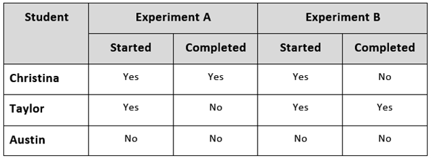
Example of a complex table
Student Progress for Science Experiments
Example of a complex table
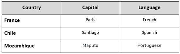
Countries, Capital, and Language
If you have questions about accessibility, need a document checked, or need an accessible document template, send an email to OVRAccessibility@ky.gov and the Accessibility Coordinator will be happy to assist you.
Learn more about accessibility:
- Accessibility Matters – Printable Quick Tips for accessible documents
- Global Accessibility Awareness Day